For the most part, as quilters we deal with a fairly two dimensional medium – fabric. Most quilts are fairly flat, at least that is what we are taught to strive for – a quilt that lies or hangs flat. It is true that there is a little raised texture from the quilting, a sort of bas relief effect created by the stitching that can be subtle if thin batting is used and may become more pronounced if a higher loft batting is used or the work enhanced with Trapunto (padding or stuffing individual shapes). There is even a Faux Trapunto where you use a high loft batting and after stitching the shapes you wish to stand out, you quilt the living daylights out of the background to flatten it and enhance the puffy shapes (see photo below). In both of those methods, care must be used to distribute the puffier shapes consistently throughout the quilt or you risk ending up with a distorted quilt that won’t hang true or lie flat.

Returning to the more subtle relief quilting, the choice of thread color will dictate whether the stitching assumes the role of a graphic design using high contrast thread or an almost invisible design made from thread that matches the fabric closely where the only observable design is that created by the light and shadow created by the subtle raised and depressed surface of the quilting. Many quilters do not fully appreciate the overall impact that even this subtle texture has on the visual appeal of the quilt.
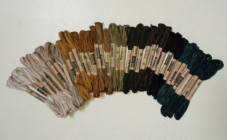
Here are some tips to those quilters who have not played much with thread color choices: As a novice quilter, you may be tempted to hide your lack of stitching skills by using a thread that matches your fabric and while it’s true that this may ‘hide’ errors pretty well, the truth is that you are more likely to make errors choosing this option. It is very difficult aligning precise stitching when you can’t see well what you have previously stitched. White/cream thread on white/cream fabric is hard enough but the worst is trying to quilt on black fabric with black thread (believe me – this is the voice of experience talking here); and ripping out mistakes on this no contrast color scheme is a nightmare (been there – done that too).
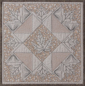
At the other (literal) end of the spectrum, quilting with a high contrast thread can create a striking graphic effect whereby the stitching becomes in essence a drawn line on your quilt. This can be gorgeous however, every little mistake or mis-stitch will be glaringly apparent. See the coparison of the two extremems below.
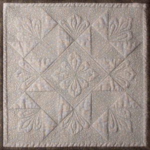
A good sensible solution is to choose a thread color that varies from the fabric just slightly by a couple of steps – lighter or darker – where your skill (or lack thereof) is not showing like a sore thumb but with a pleasing definition that shows off the stitching pattern or design to good effect.

Often I am asked by students if there is a rule of thumb regarding whether or not a quilt should be quilted in all one color of thread. My answer is that there is no set rule about this; there is no quilting ‘planning commission’ and you will not have your ‘quilting permit’ revoked because you choose to defy traditional quilting decorum. As a matter of fact, using a variety of thread colors in one project can create a much more effective visual presentation by using higher contrast thread to draw the eye to focal motifs enhancing them and using a lower contrast thread to make the background patterns recede.
In summary – remember that the subtle texture created by quilting on even a low loft quilt has a major impact on the appearance of your quilt whether someone is examining it up close to see your stitching or viewing it from a distance. Choose your quilting designs and thread colors to work within your skill comfort zone but always with the knowledge that the quilting does indeed “make the quilt”.
Stay tuned for more on texture in another post to come when I will address visual vs, physical texture.