In this second installment about texture, I want to explore the difference between visual and physical texture. Visual texture relies on the designs printed on the fabric to create graphic contrast. While contrast of color and value are extremely important to define differing areas in a quilt pattern, a variety of textures ranging from fine to bold will add depth and complexity to a quilt. These ‘visual’ textures extend from fabrics that are solid or of such a fine print that it reads almost as a solid all the way to large scale bold prints. As quilters and fabric artists, you have probably played with visual texture; it’s one of the most common considerations after color and value when assembling fabric choices for a project.

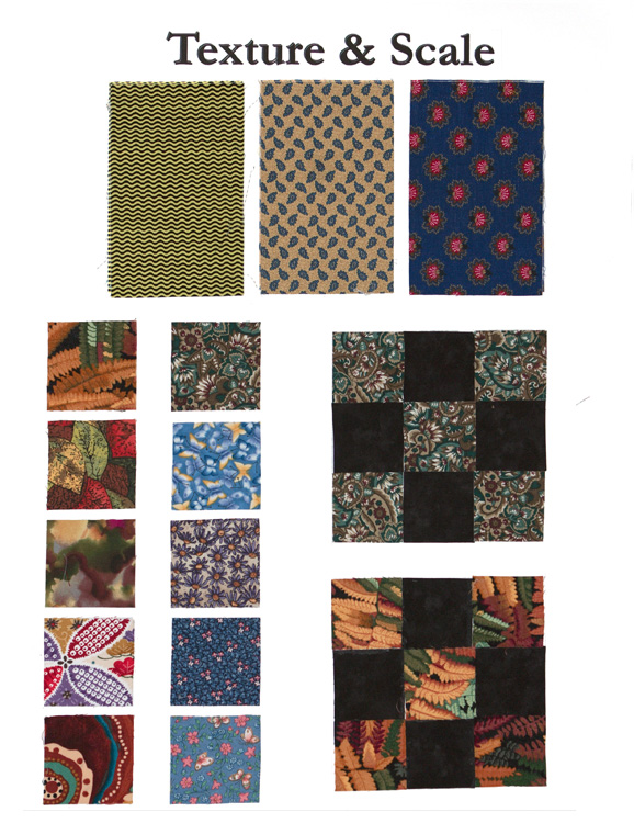
There are additional considerations when working with visual texture. You are probably all familiar with the concept of ‘fussy cutting’ a print to feature a particular motif or print design in specific parts of a quilt but what about the general use of a bold print? Many quilters don’t want to take the time to fussy cut each part of a quilt block – plus it is wasteful, turning a piece of fabric into Swiss Cheese (unless you are a scrappy quilter that will use these less desirable parts of the fabric in a scrap quilt). Many quilters wanting to make a quilt fast and easy will opt to cut the fabric efficiently and randomly with a rotary cutter. Here is where you can run into a problem; if the print is too bold for the scale of the block pattern then you may lose the definition of the design. Examine and compare the nine patch blocks in the picture below, see how the definition of the block is lost in the example with the bolder print congruous with the size of the piece you need for you quilt or block.
There are exceptions to this rule such as in Watercolor or Color-wash quilts where the strategy is to have the prints interfere with the hard pieced divisions of the squares and create a wash of color and texture that flows across the entire panel (see photo below).

Physical Texture is something completely different; it is tactile. Burlap, corduroy, denim, velvet, silks … are examples of fabric with a physical texture; these fabrics can even be dyed in a solid color and still retain their physical texture. Here’s the test – take an assortment of ‘quilters’ cottons’ in a variety of prints and spread them out. Close your eyes and run fingertips over each fabric. Other than minute variations based on thickness, quality and thread count, you will not really be able to tell one from another and you will certainly not feel any variation as regards to a fine print vs. a bold one – this is visual texture. Now spread an assortment of textural fabrics in the same manner – denim, burlap, monk’s cloth, brocade, satin, velvet, corduroy … and repeat the same tactile experiment. Unless you have no sensation in your finger nerve endings, you will be able to clearly discern the difference between a piece of velvet and a piece of burlap – this is physical texture.
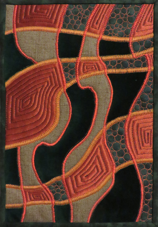
You may not be able to touch a quilt or piece of fiber art in a show or photograph but that physical texture still is apparent. The light and shadow created by the texture is visible and so is the refraction of light that reflective satiny or napped fabrics create (see image below).
I once saw some quilted panels made by a fiber artist working with velvet in a single color where he had oriented the nap of the fabric in ways to catch and refract the light; this created light and dark parts of the design that shifted depending on the angle the panel was viewed from; I wish I could remember his name.
Working with textured fabrics does have a downside. Contrast of texture is a key factor to the rich beauty of these fabrics and that means you will often be sewing fabrics of unequal weights together which can be problematic. Add the fact that many of these fabrics may fray excessively (requiring wider seam allowances) and that some fabrics like velvet and corduroy have a tendency to ‘creep’ making accurate piecing a challenge, and you have your work cut out for you. The results are worth it though.
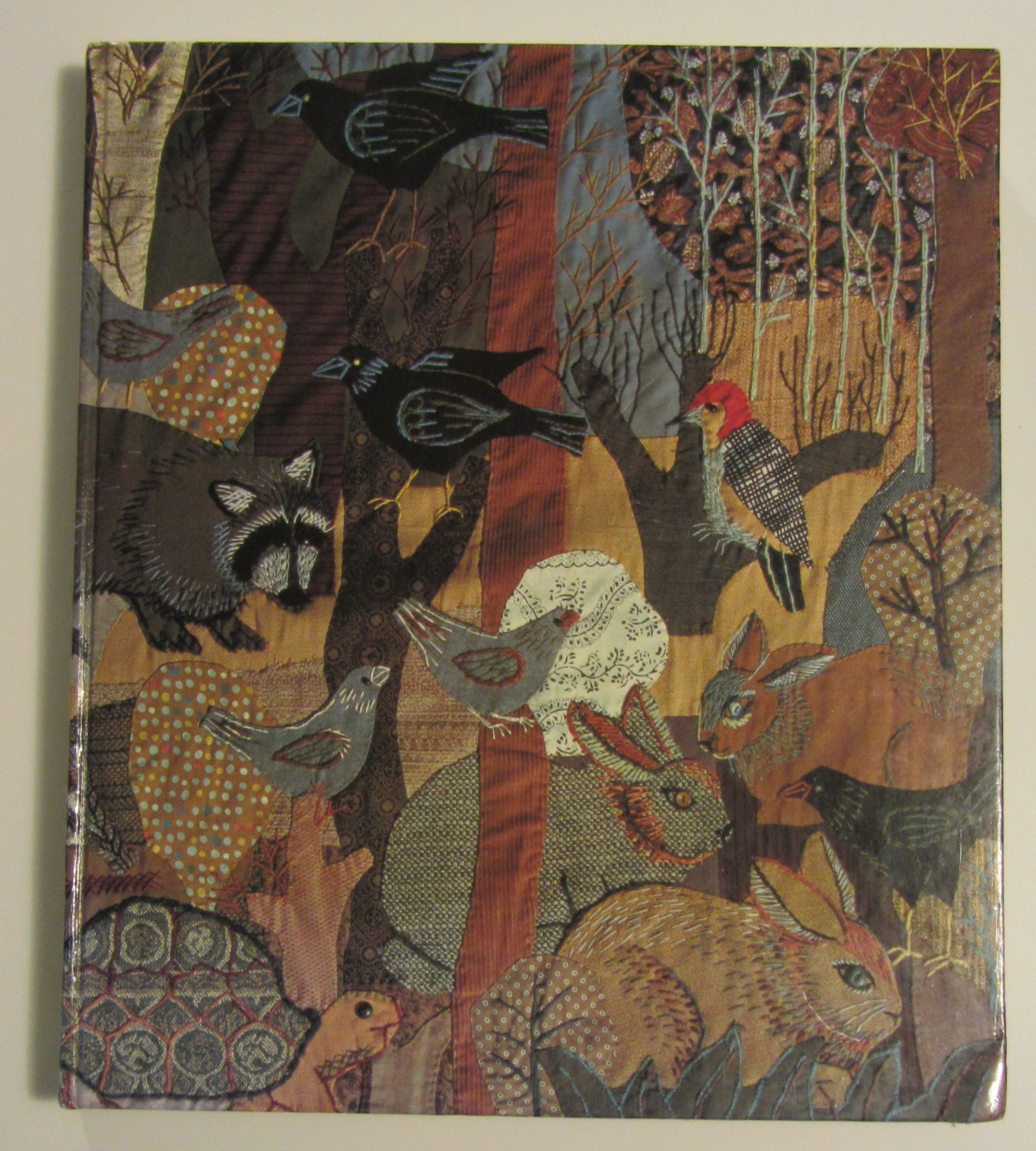
Appliqué artist Martha Mood was a master at creating what she called tapestries using a variety of fabric textures that she enhanced with hand embroidery. To see an assortment of her stunning work, Google the terms ‘Martha Mood Tapestries Images’.
Next time, we will explore three dimensional embellishments in the third and final series on texture.
